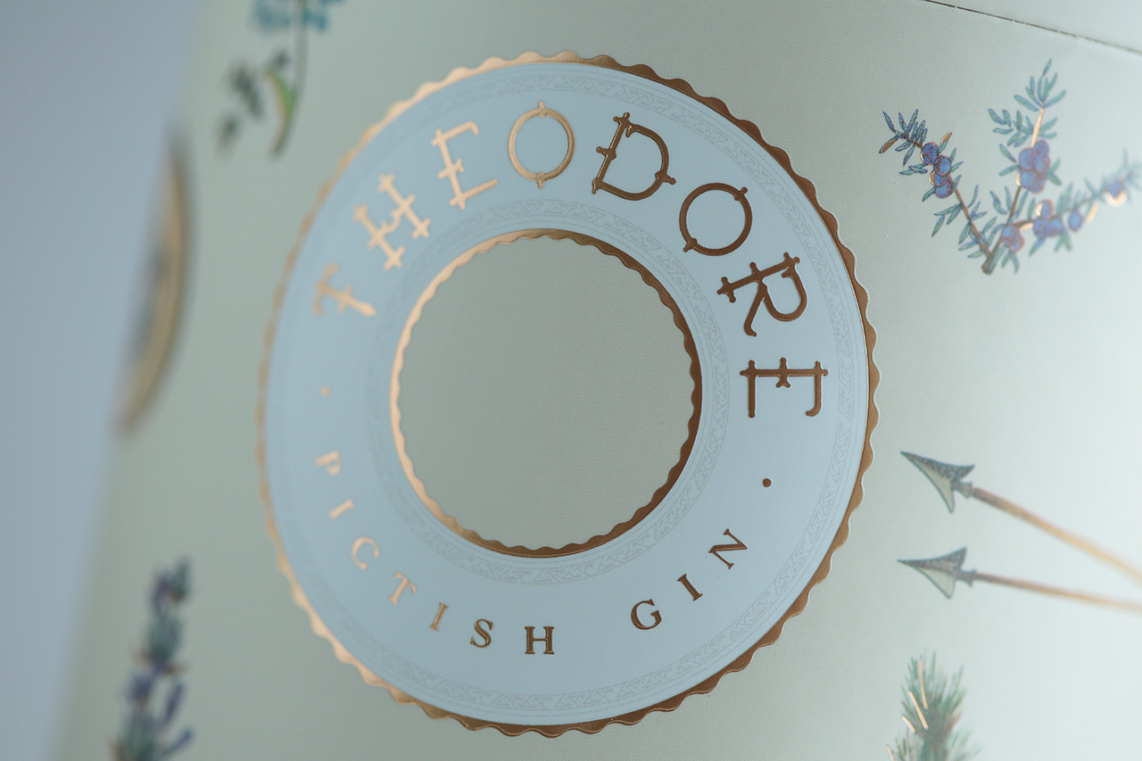
Unique character, expressed through packaging
The brief
Established in 2019, Greenwood Distillery is a young company with bold ambitions to build on Scotland’s rich distilling heritage with a range of exciting new spirits that fuse the old with the new, and the local with the exotic – always with an unswerving commitment to premium quality.
In developing the distillery’s first ever spirit – a gin – the company looked to the ancient Scottish tribe of ‘The Picts’, whose courage and craftsmanship has been largely lost save for remnants echoed in the art, engravings and forgotten fortresses of the Northern Highlands. The result is Theodore Gin, meticulously composed using 16 compelling botanicals and the first gin to be distilled at Greenwood’s home in Ardross, making it ‘Scottish by birth and Pictish by nature’. For this unique product, the Distillery needed a premium packaging solution that would emphasise its distinctive qualities whilst allowing it to compete with countless other craft gins on the market.
The challenge
The challenge on this brief was an aesthetic rather than a practical one. Greenwood Distillery wanted to carry the premium quality and unique character of Theodore Gin through to the packaging without making it prohibitively expensive, in order to compete successfully in an increasingly saturated gin market. They also wanted a pack design that would help bring the story of the Picts, who inspired the gin, to life for the consumer, whilst steering away from anything ‘olde worlde’ in appearance. Given that the bottle itself has a very stripped-back appearance, they were keen to create a box that was similarly delicate, without compromising on visual impact.
The process
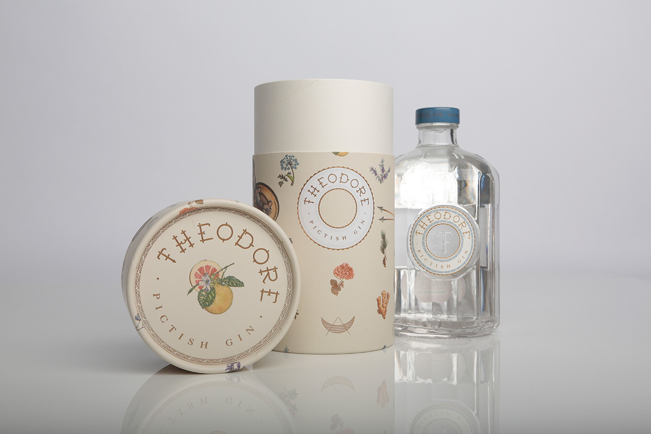
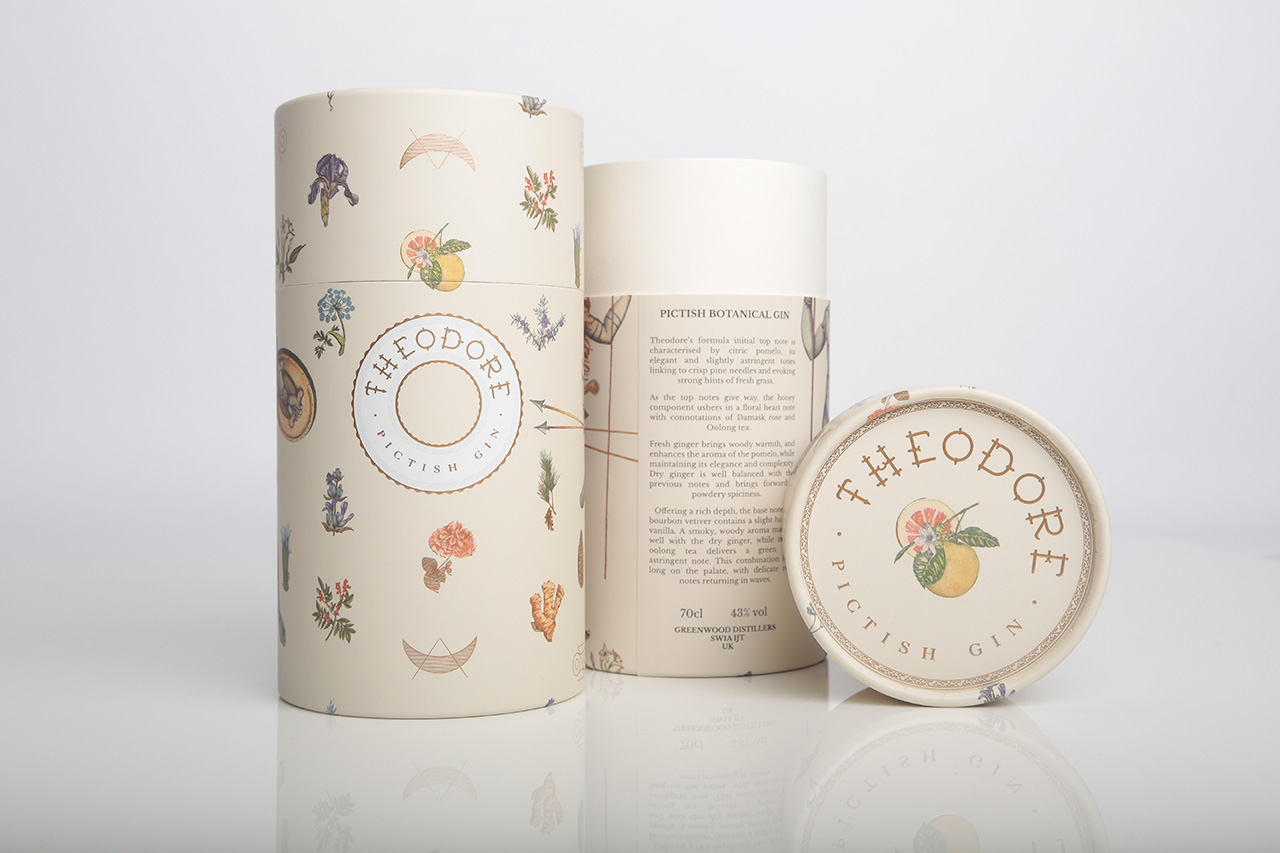
As an optimal solution for Greenwood’s requirements on aesthetic, environment and cost, Clyde produced an all-cardboard tube with a stylish roll edge to the top and bottom, which lends gravitas to the tube while retaining its 100% recyclable credentials. Both lid and base were made from heavyweight board rather than tin.
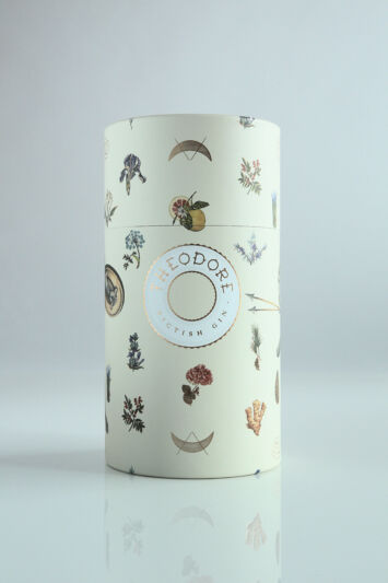
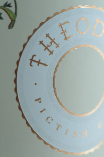
The entire tube, both internally and externally, was wound in cream to match Theodore Gin’s brand colours and the outer was further printed in four colours according to the client’s chosen design, with additional embossing of the Theodore name and some stunning copper foil elements. The design of the tube was such that when the lid was turned or removed, this would change the pictures and botanicals on the outside – a nod to the inventiveness and intrigue of the Picts.
During the process we produced a fully printed sample which allowed the client to view what the finished product would look like and make final amendments before proceeding with full production.
The outcome
The finished result is a low cost but very classy and distinctive-looking tube that helps Theodore Gin to stand out on the shelf when sitting beside hundreds of its competitors. The tube has a contemporary and whimsical feel that dovetails perfectly with the brand ethos and as well as helping the product to stand out, elevates it immediately to ‘gift’ status, ready to lift off the shelf and present to the recipient.
The client was thrilled with the finished product and the product itself now sits in many high-end outlets, including a special display in one of the world’s most famous department stores, Selfridges. The client said: “I just wanted to say a huge thank you for all your help with the tubes. They look so great and it has been a pleasure working with you so thank you for being so helpful (and understanding with all of our back and forth with amendments!!). I hope we can work together again soon.”
We were especially delighted when this pack design was awarded a ‘Master’ award at the 2019 Spirits Business Design and Packaging Masters Awards!

